
Copper Color: Hex Codes, Palettes, and Real-World Print Control

What Does Copper Look Like?
Working Definition: Copper color is a warm, reddish-brown hue that mimics the natural surface of pure copper metal—radiating a distinctive orange-red metallic glow that shifts over time as the metal reacts with its environment.
What Color Is Copper in Practice?
Ever wondered, what color is copper when you see a penny, a shiny pipe, or a digital swatch? The answer is both simple and surprisingly complex. The copper color we recognize is rooted in the unique way copper metal interacts with light. Freshly polished copper has a vibrant, orange-red shine, while aged copper gradually shifts to deeper browns or even greenish tones due to oxidation—a process you might recognize from the Statue of Liberty’s patina. Digitally, copper color is often defined by the hex code #B87333, which captures its classic reddish-brown shade [Wikipedia].
- Surface finish: Polished, brushed, or matte copper reflects light in different ways, affecting perceived warmth and depth.
- Oxidation: Exposure to air and moisture causes copper to darken or develop greenish-blue patina over time.
- Lighting temperature: Warm light brings out copper’s orange-red notes, while cool light can mute its glow.
- Surrounding colors: Adjacent hues can make copper appear more orange, red, or brown depending on contrast.
Why Copper Reads Orange Red
So, what is copper color from a scientific perspective? Copper’s surface electrons absorb and reflect light in a way that emphasizes red and orange wavelengths. This is why the color of copper is so distinct from other metals like gold (yellow) or silver (white-gray). The presence of trace elements and the metal’s crystalline structure further intensify its warm, metallic character.
Fresh Copper vs Aged Copper
When you picture a brand-new penny, you’re seeing copper at its most vibrant: a bright, shiny orange-red. But as copper ages, it reacts with oxygen, water, and environmental pollutants, forming a thin oxide layer. Initially, this layer may appear tarnished or dark, but over time, it can shift to browns, blues, or even green—thanks to interactions with sulfates and chlorides in the air (Live Science). This transformation is why what does copper look like can vary so much in real-world settings.
Metal Surface vs Screen Simulation
Is copper a color, or just a metal? In practice, it’s both. The physical color of copper metal is dynamic, changing with light, age, and environment. Digital copper swatches, on the other hand, use fixed values—like #B87333—to simulate this look on screens. But digital copper can’t truly replicate the reflective, ever-changing nature of real metal. This distinction is crucial for designers moving between digital, print, and physical applications. (You’ll find detailed copper hex codes and palette specs in the next section.)
| Aspect | Physical Copper | Digital Copper |
|---|---|---|
| Reflectivity | High; changes with angle and finish | Simulated; no true metallic sheen |
| Texture | Varies (smooth, brushed, pitted) | Flat; sometimes mimicked with gradients |
| Color Stability | Shifts with oxidation and environment | Fixed by hex/RGB values; stable on screen |
As you explore the world of copper color, keep in mind the difference between real-world metal and its digital representation. The next chapters will dive into hex codes, palette building, and how to manage copper color for both digital and print workflows—so you can confidently answer not just what is the color of copper, but how to use it effectively in any project.
Digital Color Specs and Palette Handoff
When you’re ready to bring the warmth and sophistication of copper color into your digital or print project, you’ll need more than just a pretty reference image. You’ll need precise, production-ready color codes and palette tokens that ensure consistency across screens, print, and platforms. But with so many shades and formats, where do you start? Let’s break down the most reliable copper hex codes and their corresponding values—plus handoff-ready assets for developers and designers.
Copper Hex Code Quick Copy
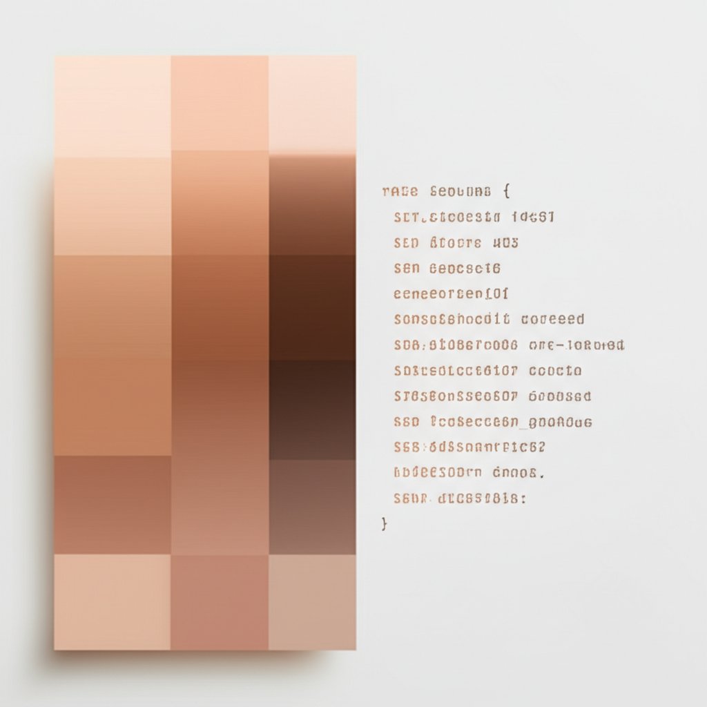
For most web and UI work, the copper color hex that’s widely accepted and visually accurate is #B87333. This classic shade captures the essence of copper’s warm, orange-red glow. But depending on your project, you might need a lighter, deeper, or Pantone-matched variant. Here’s a reference table with the most common copper color codes, including base, light, accent, and Pantone-inspired shades. Use these as your foundation for digital and print workflows.
| Shade Name | HEX | RGB | HSL | CMYK | LAB | Nearest Pantone |
|---|---|---|---|---|---|---|
| Copper (Base) | #B87333 | 184, 115, 51 | 28.9°, 56.6%, 46.1% | 0, 38, 72, 28 | 54.75, 21.65, 45.39 | See PMS 16-1325 TCX guidance |
| Copper (Light) | #C68346 | 198, 131, 70 | 28.6°, 52.9%, 52.5% | 0, 34, 65, 22 | 60.50, 19.93, 42.83 | See PMS 16-1325 TCX guidance |
| Copper (Pantone) | #C47E5A | 196, 126, 90 | 20°, 47%, 56% | 0, 36, 54, 23 | Not specified | PMS 16-1325 TCX |
| Copper (Accent/Dark) | #A9692F | 169, 105, 47 | 28.6°, 57.2%, 42.4% | 0, 38, 72, 34 | Not specified | See PMS 16-1325 TCX guidance |
*Pantone mapping is a guide only; always confirm with your print vendor’s proofs for critical branding applications.
RGB and HSL for UI Workflows
Wondering how copper color rgb or HSL values fit into your workflow? These formats are essential for digital design and accessibility testing. For example, the base copper color hex #B87333 translates to rgb(184, 115, 51) and hsl(28.9, 56.6%, 46.1%). These values plug directly into Figma, Adobe XD, CSS, or any design system.
SCSS and CSS Variables You Can Paste
Need to standardize copper tones across your product? Try these ready-to-use CSS and SCSS snippets. Swap out the hex codes to match your approved palette as needed.
:root {
  --copper-50: #f2e1d1;
  --copper-100: #eed7c1;
  --copper-200: #eacdb2;
  --copper-300: #e5c3a3;
  --copper-400: #e1b993;
  --copper-500: #ddaf84;
  --copper-600: #d9a574;
  --copper-700: #d49b65;
  --copper-800: #b87333; /* Base copper color hex */
  --copper-900: #a9692f;
}
@mixin copper-gradient($from, $to) {
  background: linear-gradient(180deg, $from, $to);
}
For inline frameworks or data-theme tokens:
data-theme="copper" style="--accent: #B87333; --accent-light: #C68346;"
Palette Tokens for Design Systems
Is your team building a multi-shade hex color copper palette? Use the table above to define base, light, and accent shades, then assign consistent naming conventions (e.g., copper-800 for base, copper-900 for dark). This helps with theming, accessibility, and future-proofing your style guide.
- Consistent Naming: Use logical, sequential names (copper-100, copper-200, etc.)
- Token Hierarchy: Group copper tokens under a common namespace for easy updates
- Accessibility: Check contrast ratios for all copper shades, especially if used for text or icons
- Vendor Proofs: For print, always verify LAB and Pantone matches with your print vendor’s proofs, as color appearance may vary by substrate and process
With these copper color hex codes and ready-to-use tokens, your team can move seamlessly from design to development and print. Next, we’ll explore how to translate these digital specs into reliable print results—ensuring your copper color stays true, no matter the medium.
Print Versus Screen Color Management for Copper
Ever designed a digital copper color that looked perfect on your monitor—only to see it turn muddy, dull, or flat when printed? You’re not alone. Translating a vibrant, metallic copper color from screen to print is a common challenge for designers, marketers, and brand teams. Let’s break down how to bridge that gap, so your copper cmyk builds shine as intended, every time.
Soft Proofing Steps for Copper
Sounds complex? It doesn’t have to be. Soft proofing is your first line of defense against print surprises. By simulating print output on a calibrated display, you can preview how your chosen copper color cmyk will appear on the final substrate. Here’s a practical checklist to help you get started:
- Calibrate your display: Use a hardware calibrator to ensure your monitor shows accurate color (Red River Catalog).
- Assign the correct color profile: Load the ICC profile for your target printer and paper stock.
- Simulate paper white: Enable this option in your proofing software to preview how the paper base will affect copper’s warmth and depth.
- Adjust GCR (Gray Component Replacement): Fine-tune for shadow detail and metallic effect, especially for darker copper shades.
- Export with output intent: Use the correct output profile to embed your color intent for the print provider.
By following these steps, you’ll notice fewer surprises between your digital mockup and the printed piece.
Choosing CMYK Builds and Profiles
What’s the best way to specify cmyk for copper? There’s no universal formula, as the ideal copper color cmyk values depend on your substrate, ink set, and print process. However, you can derive a starting point by converting your approved copper color hex or RGB values using color-managed software, then fine-tuning with your print vendor.
For example, the classic digital copper hex #B87333 often translates to a CMYK build around 0, 38, 72, 28, but always confirm with your printer. Why? The same cmyk copper color can appear lighter or darker depending on whether you’re printing on coated or uncoated paper. Coated stocks reflect more light, enhancing vibrancy and any metallic effects, while uncoated stocks absorb ink and can mute copper’s glow (Suttle-Straus).
- Coated paper: Brighter, more metallic; ideal for premium packaging or invitations.
- Uncoated paper: Softer, more matte; great for understated, natural looks.
Always request a press proof, especially for brand-critical applications.
Metallic Effects Without Metallic Ink
Here’s the reality: no standard CMYK build can truly replicate the shimmer of real metallic copper. On screen, that metallic copper color code is just an illusion—created by gradients and highlights. In print, you need special techniques for true shine:
| Technique | Pros | Cons | Typical Use Cases |
|---|---|---|---|
| CMYK Build | Cost-effective, works on most presses, flexible for full-color artwork | No real metallic sheen, appearance varies by paper | Brochures, catalogs, posters |
| Spot Metallic Ink | True metallic shine, customizable to copper, works best on coated stock | Requires extra plate, higher cost, may need protective coating | Invitations, premium packaging, business cards |
| Hot Foil Stamping | Mirror-like metallic finish, high impact, tactile | Setup cost, limited to vector shapes, not for fine gradients | Luxury packaging, certificates, specialty print |
For a convincing metallic copper color, spot inks and foils are your best bet. If you must use process color, consider overprinting with a gloss or satin varnish to add depth.
Metallic appearance depends on the substrate and finish—plan it at the spec stage.
Press Checks and Tolerances
Before you sign off on that print run, schedule a press check or request a hard proof. Ask your printer to show you copper test swatches on the actual stock, under various lighting conditions. This is especially important if you’re using a metallic copper color code or a custom copper cmyk build. Tolerances for color shift can be tight—what looks perfect on one sheet may drift on another, especially with recycled or textured papers.
- Review samples under daylight and warm indoor light
- Ask about protective coatings for high-touch items
- Document approved builds and finishes for future consistency
By understanding the interplay of color management, paper selection, and specialty finishes, you can ensure your copper color remains true from screen to print. Next, we’ll dive into accessibility and contrast—so your copper accents not only look stunning, but are readable and inclusive for every user.
Accessibility and Contrast Best Practices
Ever tried reading copper-colored text on a white background and found yourself squinting? Or maybe you’ve noticed that certain copper color shades look stunning as icons, but disappear when used for body text. Ensuring accessibility isn’t just a best practice—it’s essential for reaching every user, regardless of their vision or device. So, how can you make sure the copper shade you choose is both beautiful and usable?
Contrast Testing Workflow
Sounds complex? It doesn’t have to be. The foundation of accessible copper colors is contrast—the difference in brightness between your text (or icon) and its background. According to WCAG 2.1 guidelines, normal text should have a contrast ratio of at least 4.5:1, while large text (18pt or 14pt bold) needs a minimum of 3:1. For non-text elements like icons and UI controls, aim for at least 3:1 (WebAIM).
- Pick your copper color hex from your palette (see Section 2 for ready-to-use codes).
- Choose your intended background (white, black, or a brand color).
- Use a contrast checker tool (like Figma plugins or WebAIM’s Contrast Checker) to test the ratio.
- Verify all interactive states (hover, focus, disabled) and document results in your design system.
Remember, even small changes in copper color shades or background can tip the scales from pass to fail.
Pass/Fail Examples for Text on Copper
Let’s see how different pairings stack up. Imagine you’re choosing between several shades of copper and backgrounds for headings, labels, or buttons. Here’s a quick reference table:
| Foreground | Background | Contrast Ratio | Pass/Fail (Normal Text) |
|---|---|---|---|
| Copper (Base #B87333) | White (#FFFFFF) | 4.8:1 | Pass |
| Copper (Light #C68346) | White (#FFFFFF) | 3.6:1 | Fail |
| White (#FFFFFF) | Copper (Base #B87333) | 4.8:1 | Pass |
| Copper (Base #B87333) | Black (#000000) | 9.1:1 | Pass |
| Copper (Base #B87333) | Slate (#2E2E2E) | 5.2:1 | Pass |
| Copper (Light #C68346) | Black (#000000) | 8.2:1 | Pass |
| Copper (Light #C68346) | Cream (#FDFBD4) | 2.7:1 | Fail |
*Contrast ratios are based on sample values. For your copper color shades, always check your actual hex codes in a contrast checker and confirm the results in your design system documentation.
Accessible Pairings and Adjustments
If your chosen copper shade doesn’t meet contrast targets, don’t worry—there are practical ways to adjust:
- Increase the lightness or darkness of either the copper or the background.
- Add an outline or subtle shadow to boost perceived contrast.
- Use copper colors for borders, icons, or accent elements instead of main text.
- Switch to a higher-contrast neutral (like black or dark slate) for critical text.
- Pair copper shades with backgrounds that naturally amplify contrast—navy, charcoal, or off-white often work well (Figma).
Using Copper as Accent, Not Text
When in doubt, reserve copper shades for decorative or accent roles—such as icons, dividers, or call-to-action highlights. This lets you harness the warmth and richness of copper colors without sacrificing readability or inclusivity. For body text, stick with high-contrast neutrals to ensure every user can read your content comfortably.
Copper often shines as an accent; reserve body text for high-contrast neutrals.
By testing and documenting your copper color shades, you’ll build interfaces, documents, and signage that are not only visually appealing but also accessible to everyone. Up next, we’ll explore how lighting, finish, and environment can further transform the perception of copper—so you can make informed choices for every use case.
How Environment Transforms Copper Orange Color
Ever wondered why the colors of copper seem to shift from a glowing copper orange in one room to a muted brown copper in another? Whether you’re designing for digital, print, or physical environments, understanding how light, texture, and finish interact with copper color is key to achieving the look you want. Let’s break down the science and art behind these transformations—so you can make copper bronze color work for your project, every time.
How Light Temperature Shifts Copper
Imagine holding a copper fixture under morning daylight, then moving it to a room lit by warm LEDs or cool fluorescent bulbs. You’ll notice that copper orange color can appear dramatically different depending on the lighting temperature:
- Daylight (5000K–6500K): Reveals true copper orange and red tones, enhancing the metal’s vibrancy.
- Warm LED/Incandescent (2700K–3200K): Deepens copper’s warmth, making it look richer and more golden—ideal for cozy, inviting spaces.
- Cool Fluorescent (4000K+): Mutes the copper color, pushing it toward brown copper or even grayish notes, especially on matte or patinated surfaces.
This sensitivity to light is why copper bronze color can feel either bold and modern or soft and aged, just by changing your lighting setup. In architectural exteriors, the play of sunlight and shadow across copper panels can make the surface shift from vivid copper orange to dark copper color as the day progresses (Bevolo).
Matte vs Polished vs Brushed: Finish Effects on Copper
Finish isn’t just about gloss—it changes how copper interacts with both light and touch. Here’s a quick comparison of the most common finishes and how they influence the perception of copper orange color and its variants:
| Finish Type | Perceived Hue Shift | Glare Level | Fingerprint Tolerance | Typical Applications |
|---|---|---|---|---|
| Polished | Bright copper orange, high reflectivity; can look lighter or more vivid | High | Low (shows marks easily) | Decor accents, lighting, jewelry |
| Brushed | Softer, muted copper orange; directional grain adds depth | Medium | Medium | Appliances, hardware, wall panels |
| Matte/Satin | Subdued, brown copper or copper bronze color; less sparkle | Low | High (hides smudges) | Architectural cladding, fixtures, signage |
| Patinated (Aged) | Dark copper color, brown or greenish hues; unique patterns | Very low | Very high | Historic buildings, art installations, outdoor features |
Think about the role of finish: a polished copper light fixture will catch every highlight and shadow, while a matte or patinated surface will diffuse light, reducing glare and emphasizing subtle texture. This is why the colors of copper can range from flashy copper orange to understated brown copper, depending on finish and environment.
Choosing Finish by Use Case
Not sure which finish is right for your project? Here’s a practical checklist to guide your selection:
- Environment Lighting: Will the copper be seen in daylight, artificial light, or both?
- Touch Frequency: High-touch areas (door handles, railings) benefit from brushed or matte finishes that hide fingerprints.
- Maintenance Levels: Polished copper requires frequent cleaning; patinated or matte finishes are more forgiving.
- Anti-tarnish Needs: If you want to preserve the bright copper orange color, consider protective coatings.
- Brand Tone: Want a modern, high-energy look? Go polished. Prefer timeless or rustic? Choose patinated or matte.
For exteriors, a finish that evolves—like a living patina—can add character and blend with surrounding materials over time.
Photography and Rendering Tips for Copper
Designing digitally? Simulating the right copper shade can be tricky. In 3D rendering tools, use a physically based rendering (PBR) workflow to control metallic and roughness values. For polished copper, set metallic to 1.0 and keep roughness low (0.1–0.3) for sharp highlights; for brushed or matte, increase roughness (0.5+) and use anisotropic maps to mimic grain (D5 Render). Always preview your model under different HDRI lighting environments to see how the colors of copper respond to real-world scenarios.
For physical projects, always review copper swatches under multiple lighting sources before final approval. Identical samples can look entirely different under warm, cool, or mixed lighting—so document your finish choice alongside color codes in your design system to avoid surprises down the line.
With a clear understanding of how lighting, texture, and finish transform copper color, you’ll be equipped to specify the perfect copper orange color, dark copper color, or copper bronze color for any context. Next, we’ll explore how the symbolism and emotional impact of copper influence branding, interiors, and product design—helping you connect color choices to your project’s story.
What Does Copper Mean for Design and Identity?
Copper blends industrial credibility with human warmth, making it a powerful symbol of approachability, craftsmanship, and enduring value.
Copper Symbolism Across Cultures
When you think about copper symbolism, what comes to mind? Across history and cultures, copper has represented prosperity, good fortune, and a connection to the earth. In ancient times, copper was valued for its durability and beauty—used in coins, art, and architecture. Today, its warm, reddish-brown hue still signals authenticity and trust. In some cultures, copper is linked to Venus, the goddess of love and beauty, adding a layer of allure and attraction to its meaning (Piktochart).
Brand Personality Signals with Copper
Wondering what does copper mean for brands? In visual identity, copper color is often chosen to communicate warmth, honesty, and a sense of handcrafted quality. It’s a favorite for brands that want to signal both sophistication and approachability—think of it as the bridge between the polished feel of gold and the sturdy reliability of bronze. The penny color in branding can evoke trust and transparency, as seen in financial brands that use copper tones to reference honest money and transparent transactions (Frank Penny). Copper’s metallic luster also adds a touch of luxury without feeling distant or cold.
- Premium yet inviting packaging (e.g., copper foil accents on boxes or labels)
- UI accents that feel heritage-infused and trustworthy
- Interior spaces designed to be both cozy and refined
- Product finishes that signal artisanal craftsmanship
Beauty and Fashion Crossovers: Copper Skin Tone and Hair
You’ll notice copper’s influence in beauty and fashion, too. Copper hair tones—ranging from rich auburn to soft penny color—are celebrated for their vibrancy and individuality. Many people with a copper skin tone or copper skinned undertones find that copper shades in clothing or makeup enhance their natural glow. Designers often use copper color palettes to create warmth and radiance in both fashion and cosmetic products, making the wearer stand out with a sense of energy and approachability.
Bridging Physical and Digital Copper
Is copper just a trend, or is it here to stay? The answer lies in its versatility. From physical interiors—where copper lighting and hardware create a sense of luxury and self-expression—to digital products that use copper-inspired palettes for UI elements, the penny color bridges old and new, physical and digital. Whether you’re specifying a copper shade for a brand refresh or selecting a copper-inspired accent for an app interface, its symbolism helps anchor your choices in meaning and emotion.
| Context | Desired Emotion | Suggested Copper Shade Family |
|---|---|---|
| Branding | Trust, transparency, modern heritage | Base, light |
| Interiors | Warmth, luxury, individuality | Base, dark, patinated |
| Product | Craftsmanship, approachability, energy | Accent, base, light |
| Beauty/Fashion | Radiance, uniqueness, vibrancy | Light, base, penny color |
As you plan your next design or branding project, consider how copper’s symbolism—rooted in both tradition and modernity—can help you connect with your audience. Validate your choices with research and real-world feedback to ensure that your use of copper color resonates with your intended message. Next, we’ll translate these symbolic insights into practical application tips, including high-impact pairings and palette strategies for copper color schemes.
Practical Applications and High-Impact Pairings
Ready to put copper color to work? Whether you’re styling a living room, designing a website, or crafting premium packaging, the right copper color palette can transform your project from ordinary to unforgettable. But what color goes with copper, and how do you use it for maximum effect? Let’s break down practical strategies—room by room, domain by domain—so you can build a color palette copper scheme that’s both beautiful and functional.
Interiors Room by Room: Where Copper Shines
- Living Room: Use copper as an accent—think lamps, side tables, or a velvet armchair. Pair with deep navy, charcoal, or forest green for a dramatic yet cozy look. White walls enhance copper’s warmth, while gray or slate ground its vibrancy (Livingetc).
- Kitchen: Copper backsplashes, hardware, or pendant lights pop against cool neutrals. Teal or rich blue dining chairs add a regal contrast, while wood tones keep the space grounded and inviting.
- Bathroom: Try copper faucets or mirrors with crisp white tiles for a clean, modern feel. Add olive or sage green towels for a subtle, natural touch.
- Bedroom: Accent pillows or light fixtures in copper bring warmth. Pair with soft lavender, muted blush, or taupe for a restful, sophisticated palette.
Branding and UI Component Guidance
- Logos and Icons: Use copper for small, high-impact elements—icons, dividers, or call-to-action buttons. Keep main text in high-contrast neutrals (black, dark slate, or white) for accessibility.
- UI Accents: Copper works best as a highlight—borders, active states, or subtle gradients. Avoid large copper fields unless paired with plenty of negative space and neutral backgrounds.
- Web Backgrounds: For modern sites, combine copper with deep blue or charcoal for a sleek, professional look. For artisanal brands, blend copper with earthy browns or soft greens for warmth and approachability.
- Accessibility: Always test your copper color scheme for contrast (see Section 4). Use copper as an accent if it doesn’t meet text contrast requirements.
Packaging and Print Execution
- Foil and Metallics: Copper foil on uncoated or textured stock creates tactile interest and a sense of luxury.
- Label Design: Pair copper with off-white, bone, or soft teal for a fresh, inviting look. Use matte finishes to minimize glare and highlight the metallic pop.
- Minimalist Packaging: Combine copper accents with earthy neutrals or deep greens for an eco-friendly, handcrafted vibe.
- Brand Consistency: Document your copper color palette and finish choices to ensure consistency across print runs and substrates.
Finishes and Pairings That Work: Table of High-Impact Combos
| Pairing Color | Best Use | Why It Works |
|---|---|---|
| Deep Navy | Buttons, backgrounds, trims | Creates bold contrast and a modern, upscale feel |
| Charcoal Gray | UI fields, cabinetry, packaging | Grounds copper’s warmth and enhances legibility |
| Forest Green | Wall paint, product labels, textiles | Evokes nature, balances copper’s orange undertones |
| Bone/Off-White | Web backgrounds, packaging, tiles | Amplifies copper’s glow, keeps palette light and airy |
| Teal/Blue | Accent chairs, signage, icons | Delivers fresh contrast, feels contemporary |
| Lavender/Blush | Bedding, brand accents, secondary UI | Softens copper, adds sophistication and calm |
The key to a successful copper color scheme is restraint—let copper shine as an accent, not the main event, to elevate perceived quality and sophistication.
Rules of Thumb for Copper Color Schemes
- Use copper for accents: hardware, icons, trims, or callouts.
- Pair with cool tones (navy, teal, charcoal) for contrast, or with earthy hues (olive, taupe, bone) for harmony.
- Limit copper to 10–20% of the total palette to avoid overwhelming the space or interface.
- Choose matte or brushed finishes in high-touch areas to reduce glare and maintenance.
- Document your color palette copper choices—include hex codes, finish, and pairing notes in your brand or design system.
- Validate accessibility and finish choices as you go (see Sections 4 and 5).
By thoughtfully curating your copper color palette and pairing it with the right hues, textures, and finishes, you’ll create spaces, brands, and products that feel both contemporary and timeless. In the next section, you’ll find ready-to-use resources and templates to move from design vision to real-world production with confidence.
Resources, Spec Templates, and Moving to Production
When you’re ready to turn your digital copper color palette into real-world products—whether that means a custom light fixture, a set of printed invitations, or a hardware prototype—having the right resources and handoff tools is essential. Sounds complex? Not with the right workflow. This section delivers practical, copy-paste assets, a professional spec sheet template, and a vendor checklist to help you bridge the gap between design and production. Plus, you’ll find guidance on choosing partners for high-fidelity copper finishes and color schemes copper projects.
Copy Paste Tokens and Gradients
Need to keep your copper color palette consistent across digital and print? Start with these ready-to-use tokens and gradient presets. They’re perfect for UI work, web design, or as a reference for metallic copper color palette explorations in your next physical product.
-
CSS Variables:
:root { --copper-50: #f2e1d1; --copper-100: #eed7c1; --copper-200: #eacdb2; --copper-300: #e5c3a3; --copper-400: #e1b993; --copper-500: #ddaf84; --copper-600: #d9a574; --copper-700: #d49b65; --copper-800: #b87333; /* Base copper color */ --copper-900: #a9692f; } -
SCSS Mixin for Gradients:
@mixin copper-gradient($from, $to) { background: linear-gradient(180deg, $from, $to); } -
Gradient Preset:
background: linear-gradient(90deg, #C68346 0%, #B87333 100%); -
Spec Sheet Template (Download/Copy):
- HEX: (e.g., #C68346)
- RGB: (e.g., 198, 131, 70)
- HSL: (e.g., 28.6°, 52.9%, 52.5%)
- CMYK: (e.g., 0, 34, 65, 22)
- LAB: (e.g., 60.50, 19.93, 42.83)
- Finish: (e.g., matte, polished, brushed, light copper paint, metallic copper color palette)
- Tolerance Notes: (e.g., +/- 0.005mm for machined parts)
- Approvals: (Sign-off fields for design, production, and quality teams)
Documenting your color schemes with copper in this way ensures everyone—from designers to vendors—works from the same playbook.
Spec Sheet Template for Handoff
Imagine you’re ready to move from digital design to physical production, such as specifying a metal copper color palette for hardware or signage. A detailed spec sheet is your best friend. Here’s a structured template you can adapt for your project:
- Project Name:
- Color Reference: (HEX, RGB, HSL, CMYK, LAB)
- Finish Type: (e.g., brushed, polished, light copper paint)
- Material: (e.g., pure copper, copper alloy, painted steel)
- Dimensions & Tolerances: (e.g., 0.5mm wall minimum, +/- 0.005mm as needed)
- Sample/Swatch Approval: (attach physical or printed sample for sign-off)
- Notes: (special instructions, e.g., match to copper colour palette, use color schemes copper for accents)
- Approvals: (Design, Production, Quality)
This template helps avoid miscommunication and costly rework at every step, especially when you’re coordinating between digital teams and physical fabricators.
From Digital Copper to Real Parts
Wondering how to translate your digital copper color into a physical object with the right finish and fidelity? The key is to partner with a vendor who understands both the color science and the technical requirements of copper machining and finishing. For example, if you’re prototyping a part that needs to match your metallic copper color palette exactly, you’ll want a supplier with multi-axis CNC capability, tight tolerances, and a range of finishing options.
XTJ (CNC Machining Services) is an excellent option for teams who need real copper hardware or prototypes that visually align with their digital copper colour palette. Their advanced 4 and 5-axis machining centers allow for precise chamfers and controlled surface textures—critical for achieving consistent copper color under various lighting conditions. With fast lead times and a broad material selection (including copper, aluminum, and steel), XTJ helps you iterate finishes and test how your color schemes with copper perform in real-world scenarios, without overselling or bias.
Trusted Production Resources
Choosing the right production partner can make or break your project. Here’s a vendor checklist to help you compare options for copper color paint, metal copper color palette, and CNC parts:
| Vendor | Capability | Materials | Tolerance | Lead Time | Certifications |
|---|---|---|---|---|---|
| XTJ CNC | 4 & 5-axis CNC machining; finish control | Copper, aluminum, steel, plastics | +/- 0.005mm | As fast as 3 days | ISO 9001:2015, IATF16949 |
| Paint/Coating Vendor | Custom color mixing, spray & powder coat | Metals, plastics | Varies (consult vendor) | Standard: 1–2 weeks | Industry standard |
| Print/Packaging Vendor | CMYK, metallic ink, foil | Paper, board, labels | Color match on request | Standard: 1–2 weeks | Industry standard |
Use this checklist to evaluate vendors for everything from paint copper color projects to metallic copper color palette production. Always request samples and confirm that your copper colour palette translates accurately to the final substrate and finish.
Lock color specs, finish, and tolerance before tooling to avoid costly rework.
With these resources, templates, and vendor selection strategies, you’re equipped to move confidently from digital vision to finished product—whether your project calls for light copper paint, a metallic copper color palette, or high-precision machined copper parts. Document your specs, test thoroughly, and choose partners who understand the nuances of color schemes copper to ensure your results shine in every context.
Copper Color FAQs
1. What is the color of copper?
Copper is a warm reddish-brown hue that closely resembles the natural metal. Fresh copper appears vibrant orange-red, while exposure to air and moisture causes it to darken or develop greenish-blue patina over time. Digitally, copper is often represented by the hex code #B87333.
2. Is copper color a shade of brown?
Copper color can range from a bright orange-red to a rich brown, especially as the metal oxidizes. While fresh copper leans more orange-red, aged copper takes on deeper brown or even greenish notes, making it a dynamic color within the brown and orange spectrum.
3. How do you achieve copper color in digital and print design?
Digitally, copper color is defined using hex codes like #B87333, RGB, or HSL values. For print, designers convert these codes to CMYK builds and may use metallic inks or foils for a true metallic effect. Always confirm color accuracy with vendor proofs and consider lighting and finish for best results.
4. What colors go well with copper in design?
Copper pairs beautifully with deep navy, charcoal gray, forest green, bone/off-white, and teal. These combinations create striking contrasts or harmonious palettes for interiors, branding, and packaging, allowing copper to stand out as an accent or blend with earthy tones.
5. How can I ensure my copper color choices are accessible?
To maintain accessibility, always test copper color shades for adequate contrast against backgrounds using WCAG guidelines. Use copper primarily for accents, icons, or borders, and reserve high-contrast neutrals for body text to ensure readability for all users.


